
Please visit the exhibition of Marilyn Minter’s paintings

Mercury, 2011 by Marilyn Minter
Oct 28 – Dec 4
Salon 94 Bowery
243 Bowery
New York, NY 10002
Tuesday 1pm-6pm Wednesday – Saturday 11am-6pm Sunday Thru Dec 8 1pm-6pm
Please visit the exhibition of Marilyn Minter’s paintings
Mercury, 2011 by Marilyn Minter
Oct 28 – Dec 4
Salon 94 Bowery
243 Bowery
New York, NY 10002
Tuesday 1pm-6pm Wednesday – Saturday 11am-6pm Sunday Thru Dec 8 1pm-6pm
As our class explores the idea of a contemporary exploration of Toile by creating patterns from narrative, it is important to look at artists and designers who also use this tactic in their work.

The late Keith Haring was an important artist based in NYC who used a simple graphic language in a compelling way. His use of bold color, graphic line, texture and an all over approach to pattern in his painting, drawing, printing and sculpture provide us with an excellent example of how to effectively use pattern and narrative.
Visit the exhibition: Keith Haring at Pace Prints Gallery
521 West 26th Street, NYC
Through December 3, 2011
http://paceprints.com/exhibition/2011-10-Haring

Color plain and simple
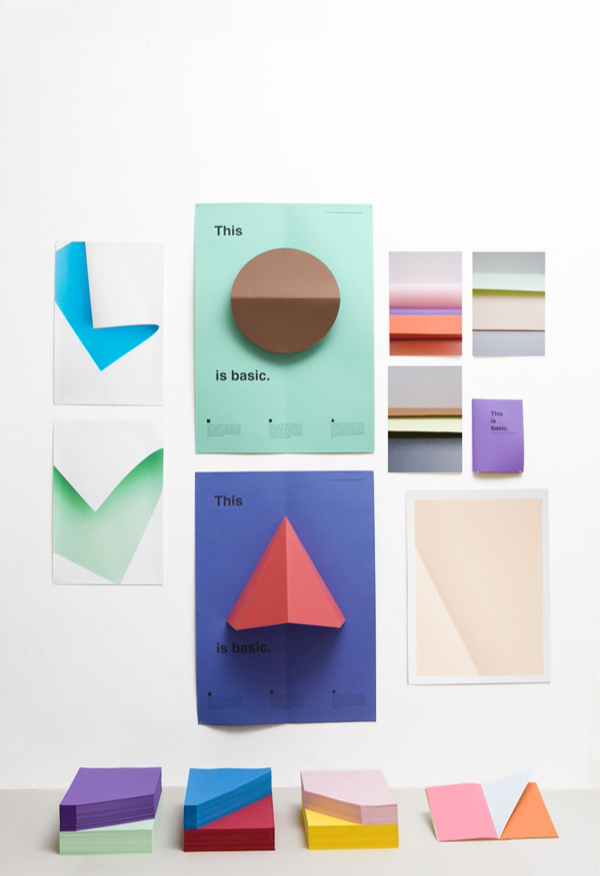
For the Lift-Off exhibition, Raw Color presented an investigation into spatiality, making use of the simplest of ingredients with which the painter is accustomed to working. Artist/designers focus on planes, lines, shadows, colours and reflections, details that usually go unnoticed suddenly play an important role. The corners that move away from one another, the shadow modulation on a surface, darker at the top and catching progressively more light as it moves downward. This is a simple and subtle approach to exploring colour and its impact.
Part of ‘This is Basic’ research is the photoseries. Here the focus is on the structure and spatiality of paper. By means of shadow, reflection, lines and color arises an abstract image. Through the exposure appears a color gradient and reflections which normally stays unnoticed. Paper doesn’t feel like paper anymore. The photos were exhibited at the exhibition Lift Off. more

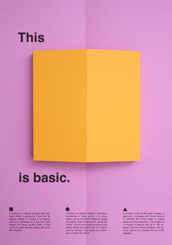
Type, first and foremost is a means of communication. However if we step back and look at typographic characters and look at them as forms (point, line, plane) we can begin to see their abstract qualities and look for ways to use them to create texture, pattern, rhythm and weight in a visual design.
Take a look at these examples of text as texture.
Look at the qualities of a typeface. In the most abstract these qualities are point, line and plane. Looking at it from a purely visual and formal point of view we can see the characters of type, and groupings of text as pattern and texture.
The examples below were created with type. The first creates a simple silhouette the second and third more effectively use scale, proximity, repetition and layering to create a rich texture that renders the tonal areas of the implied image.

Type used as texture to create a silhouette of a human head.


Text blocks have their own inherent texture. By varying the scale, style, leading, tracking, alignment and using a structure and grid a compelling visual texture, visual weight and rhythm can be created that is both abstract and can be used to convey the content in an interesting manner.


M.I.S.T.A.M.A.N. print by Corrado Grilli
Integrating image and the texture of text in order to communicate ideas expressively as well as legibly.

Poster by Andy Smith
In this next set of examples the texture of the typographic compositions make use of scale, tight leading (the spacing between lines of type), variations in style (bold, condensed, light, black, medium, etc., and layering to create a vibrant visual field that is simultaneously legible and readable and abstract in its use of rhythm, structure and texture.

Yale school of architecture Posters, 2003-2006. Designers: Michael Bierut et al, Pentagram. Produced over a series of years for a single client, these posters apply diverse typographic treatments and hierarchies to similar bodies of content. The black-and-white palette creates consistency.
Texture created with type.

Typographic poster by Emanuel Cohen


Below is a simple and expressive use of typography to map out the neighborhoods of Brooklyn, NY.

Here is a playful example of type used as form to create another image.

Typographic poster by Stefan Sagmeister
To get inspired for creating some patterns here are a few to check out.
Explore more on http://www.patternpeople.com/

Beautiful New World / 美丽新世界 , Computer collage, Digital print / 电脑拼贴,数码照片

Michael Lazarus, I'm a Rainbow Too 2006 enamel and collage on wood 23 7/8 x 17 1/4 in.
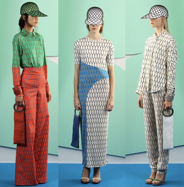
Cool chicken wire inspired patterns for textiles.
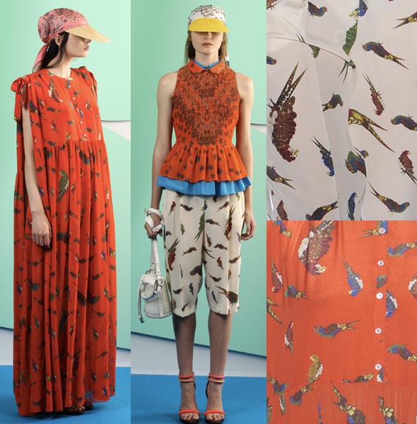
Textile in this Kenzo print inspired by ornothological drawings, a parrot toss of patterns.
Grids have long been used by designers to aid and measure composition and to create a framework with which to construct the design.
Grids come in many shapes and sizes, and generally they’re not much to look at, just a bunch of lines. But it’s the relationship a designer has with this grid that makes them so much more than just lines. They are the framework of possibility. It’s only when a designer sits down and correctly designs a grid that these possibilities reveal themselves.

One of the most effective principles in grid design is called the Rule of Thirds, also known as the golden grid rule. The Rule of Thirds is a technique which is applied by dividing a space into thirds, both vertically and horizontally, creating a grid of rectangles. It is perhaps most widely used as compositional theory in photography and film.

The rule states that every composition can be divided into nine equal parts by two equally-spaced horizontal lines and two equally-spaced vertical lines. The four points formed by the intersections of these lines can be used to place the most important elements — the elements you’d like to give a prominent or dominant position in your designs. Aligning a composition according to Rule of thirds creates more tension, energy and interest in the composition than simply centering the feature would.

Related Links
Many theories on aesthetic measurement have their basis in numerical patterns that occur naturally such as the proportions of the human body, for example the distance between your elbow and the tip of your fingers compared to the distance between your elbow and your wrist. Renaissance artists such as Leonardo da Vinci used these ideas when addressing proportion in architecture, painting and sculpture.


The golden ratio is the ratio between two segments such that the smaller (bc) segment is to the larger segment (ab) as the larger is to the sum of the two segments (ac), or bc/ab=ab/ac=0.618 The golden ratio is irrational (never-ending decimal).
Theories, such as the golden ratio (also known as the golden mean, golden number, golden section, golden proportion, divine proportion and section aurea) arise from natural patterns and they are applied in the visual and creative fields to create “beauty” by way of considered composition. The Golden Section is found throughout nature, mathematics, architecture, art and design. It is derived from a naturally occurring number, called Phi (1.618), which has intrigued humanity for thousands of years.
For the sake of discussion, let’s say that you have an area of 10 inches by 14 inches within which to compose a design.
If we multiply the width by the number associated with the golden ratio .618 then you may identify how to apply the golden ratio to a two column modular typographic grid.
10” X .618 = 6.18”

You can also use this technique to locate an important focal point within a grid by multipling the height by .618. The intersection point of the two perpendicular lines will reveal an important focal point within the golden ratio of the design area.
14” X .618 = 8.65”

This was used often in portraits where the center of the face or one of the eyes of the subject would fall on this point. It can be a very arresting visual tactic. Here is an example of how it might be approximately applied to a painting by Gian Lorenzo Bernini “Self-Portrait as a Young Man” circa 1623, Oil on canvas, Galleria Borghese, Rome.

Try using this system to create a focal point for the composition of your design or work of art.
Here is a wonderful example of rotational symmetry by the artist Donna Sharrett.

Donna Sharrett Praise You, 2003 - 2005 rose petals, synthetic hair, handmade rose beads, guitar-string ball ends, bone beads, rings, synthetic and glass beads sewn to a hand-tinted wax covered box, with an embroidered ribbon attached with hammered pins , 18 x 18 inches

Donna Sharrett Magnificent, 2011 Handmade lace, bone beads, jewelry, guitar strings, synthetic hair, and dirt , 12 x 12


